2024
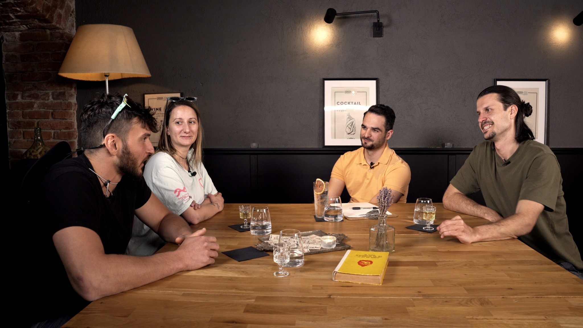
A first of its kind podcast that takes a close look at the restaurant industry, sharing important insights straight from the kitchen.
Brand Identity Design
Brand Identity Design
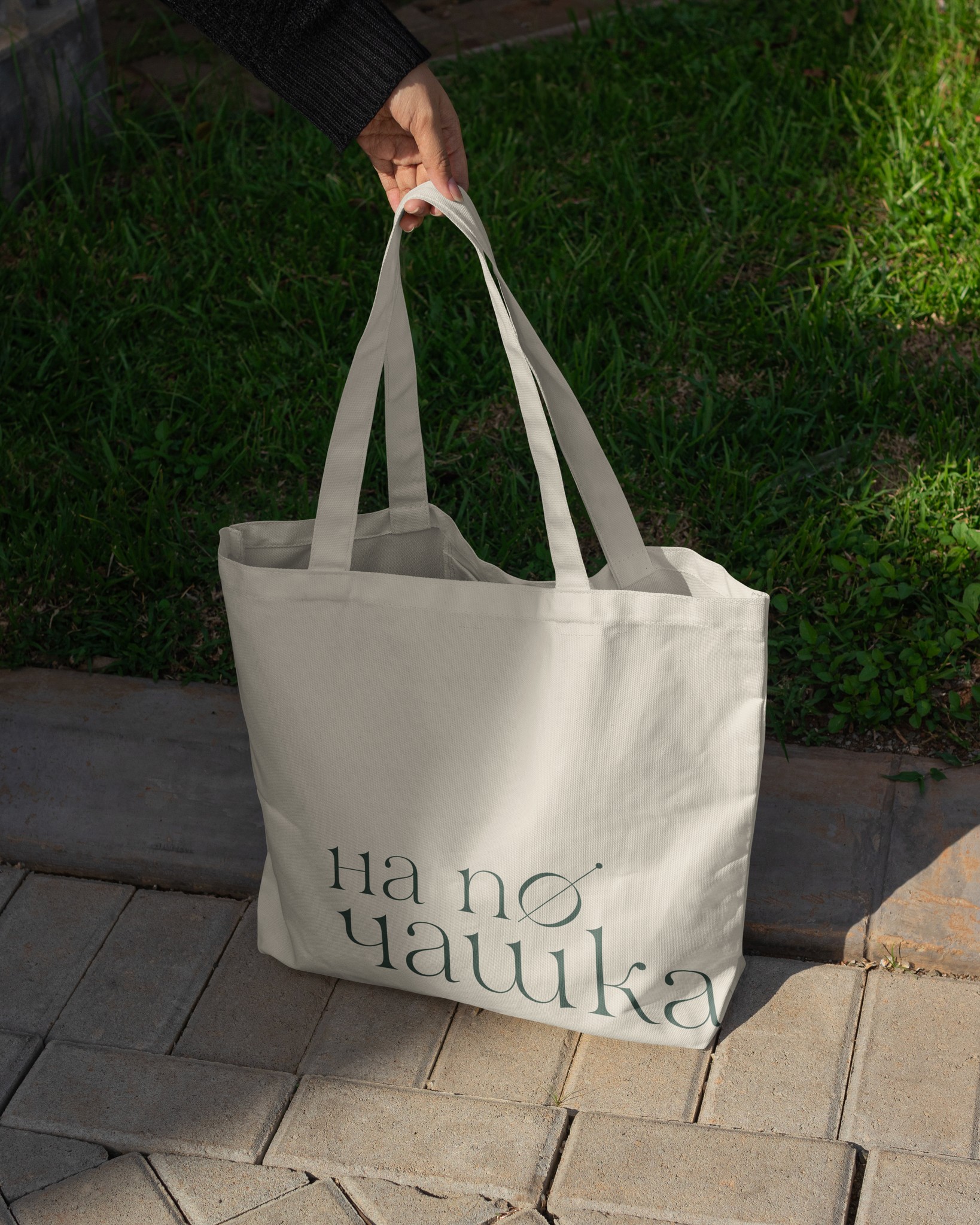
To quickly establish a consistent, unique, and recognizable visual identity, the approach focused on creating a versatile logo system that set the foundation for a strong social media presence and playful merchandise. This was key to engaging the audience and fostering a community feel around the podcast. By ensuring brand consistency across all platforms, the strategy helped attract new listeners and build a loyal audience, allowing the podcast to hit the ground running and grow quickly.
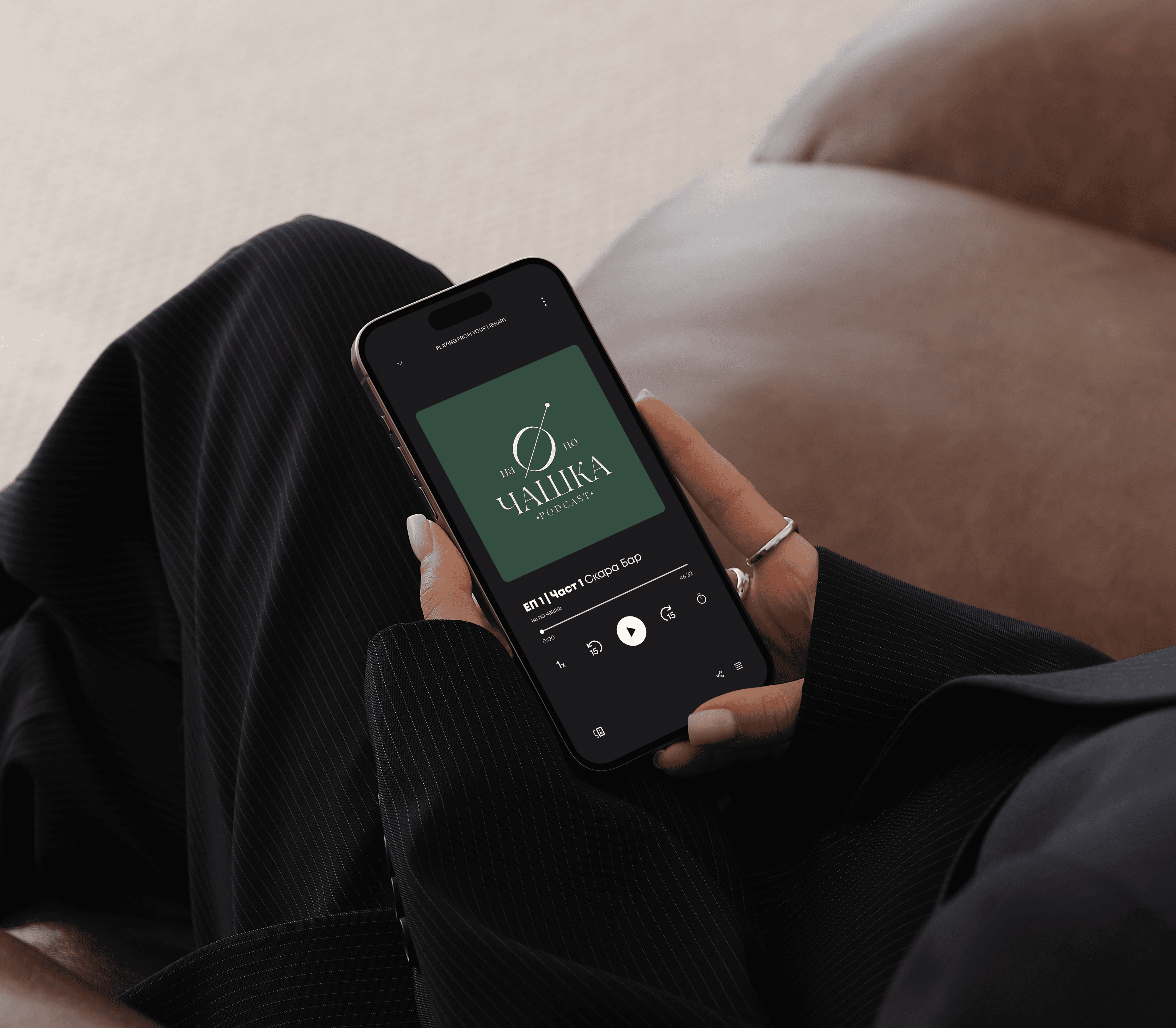
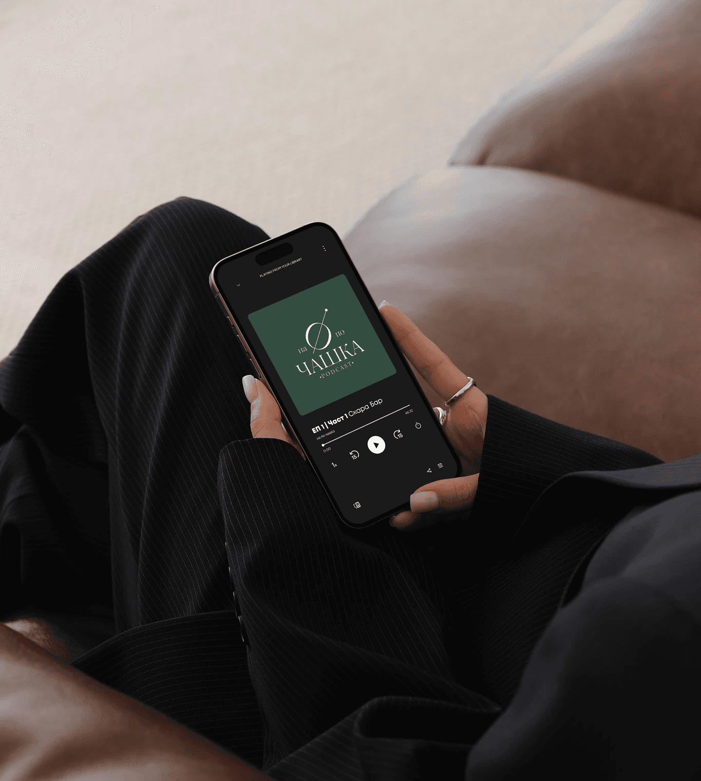
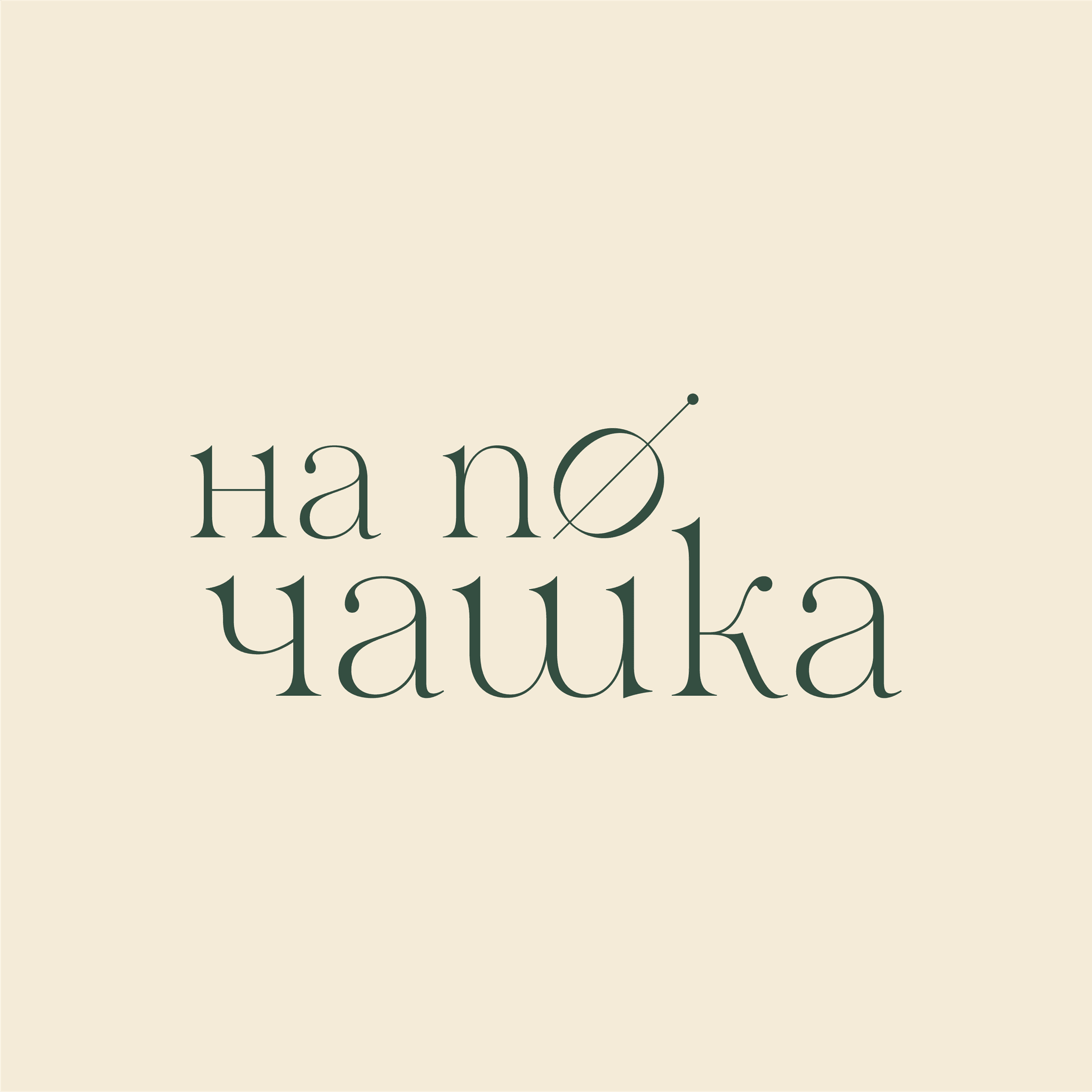
Logo Theory
For the "на по чашка" podcast, I developed a versatile logo system featuring a primary logo mark, logotype, roundel and combination mark. The logo mark was inspired by the podcast's focus on the restaurant industry, creatively reimagining the letter "O" as a cocktail olive - an inventive nod to food and drink culture. This distinctive design element was crafted to ensure the logo stands out while maintaining consistency across both digital and physical applications.

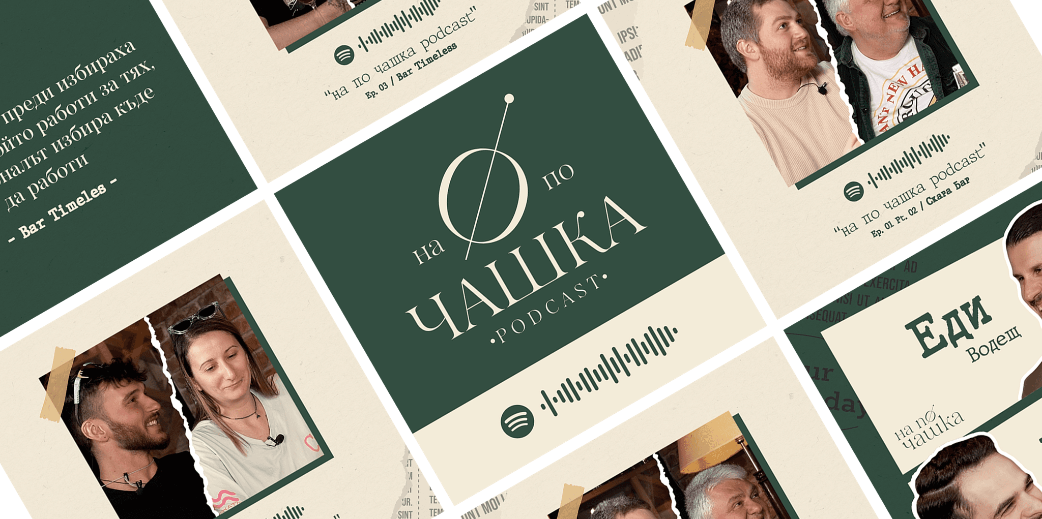
Social Media Presence
I also laid the foundation for "на по чашка"’s social media presence by creating visually appealing assets that keep the audience engaged with their favorite podcast. This strategy reinforces the brand identity and ensures consistent visuals across all digital platforms.
Tailored Approach
Our approach to "на по чашка" met our goals by effectively setting the foundation for the podcast's visual identity, branding, and social media presence. This helped the newfound show hit the ground running and develop a niche but, engaged audience of loyal listeners.
© 2025